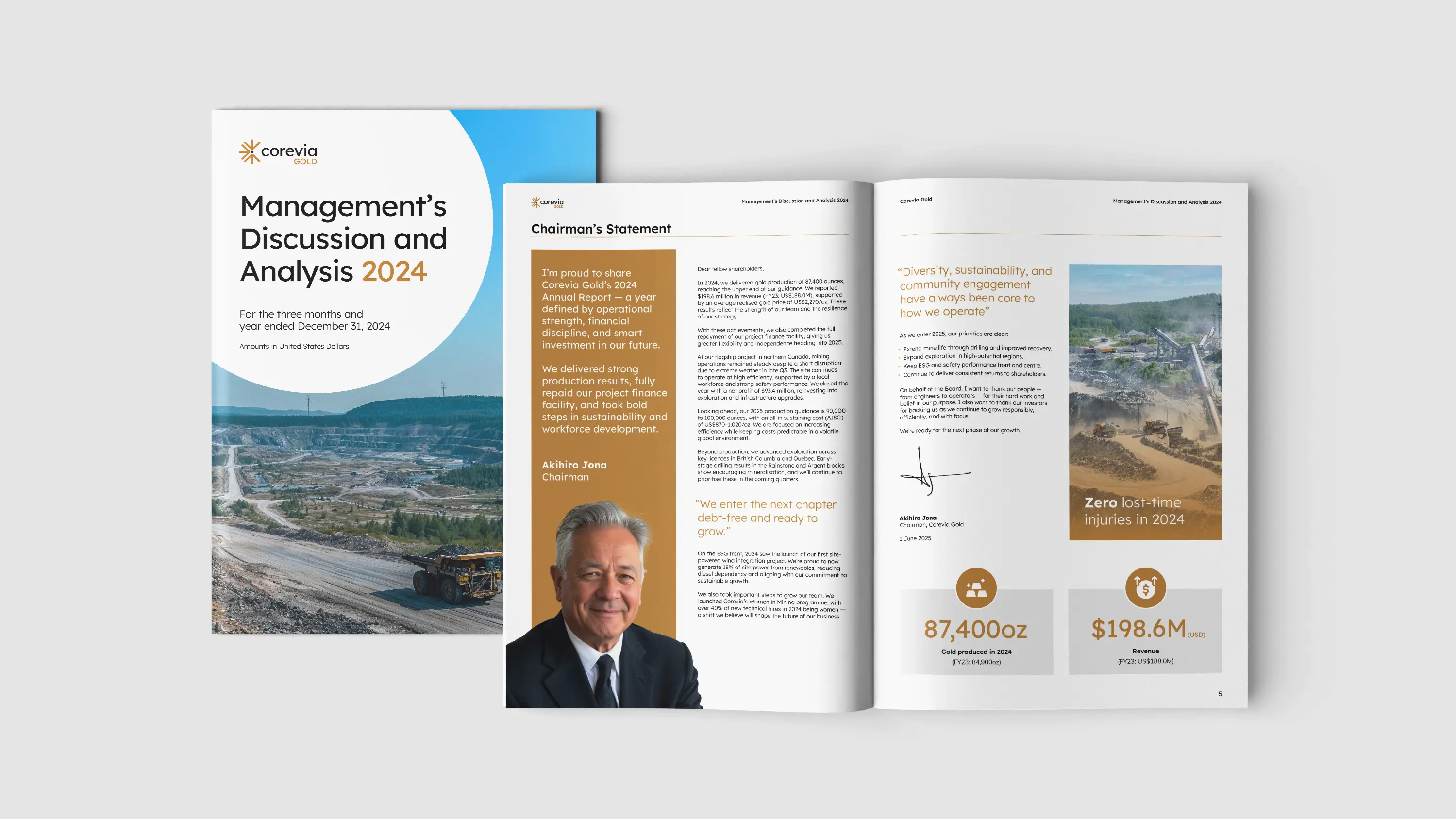
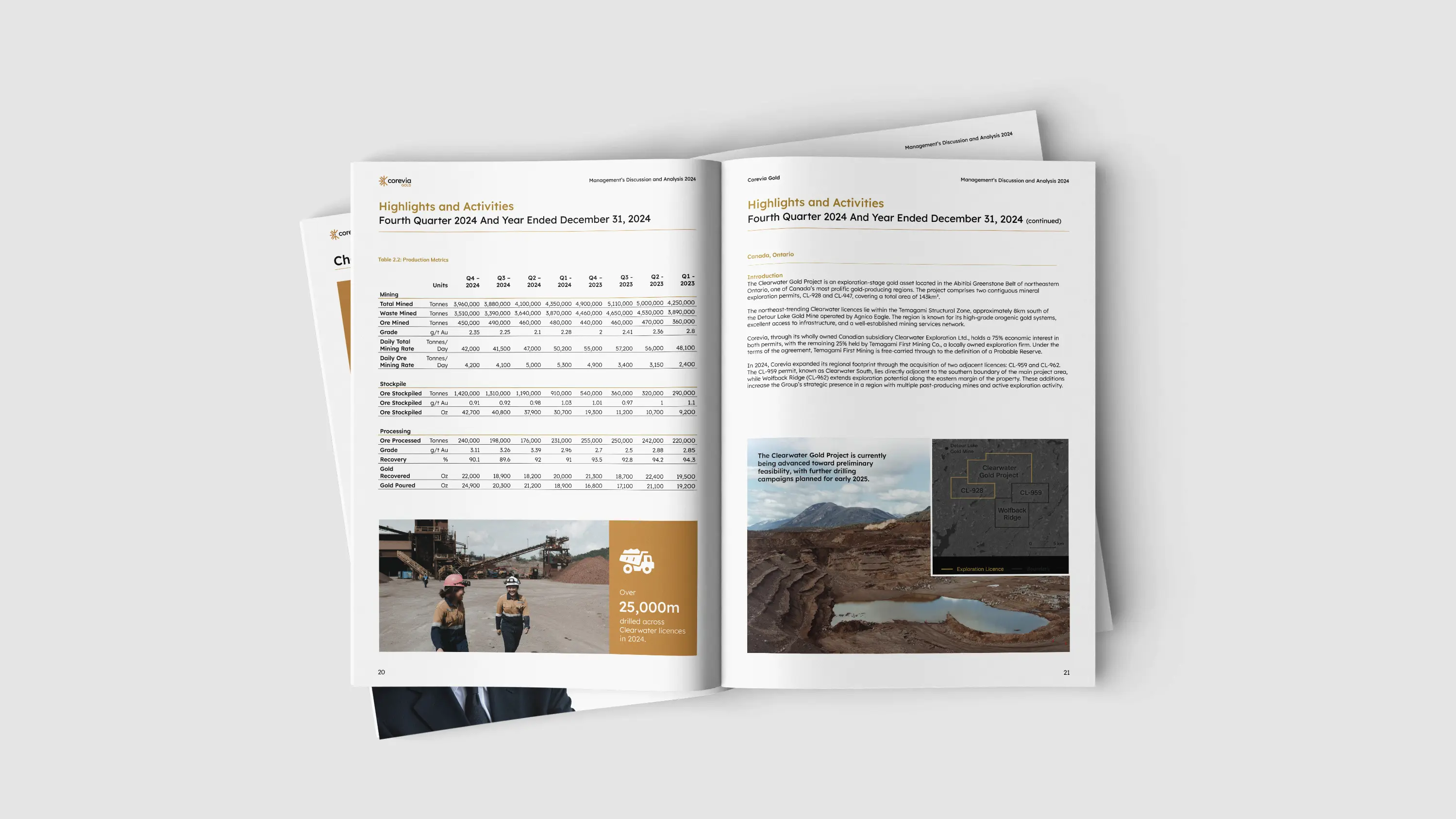
Corevia Gold
Corevia Gold is a forward-focused mining company with a name that speaks to precision and purpose. They needed a brand that would reflect clarity, connection, and value across both corporate and operational touchpoints.
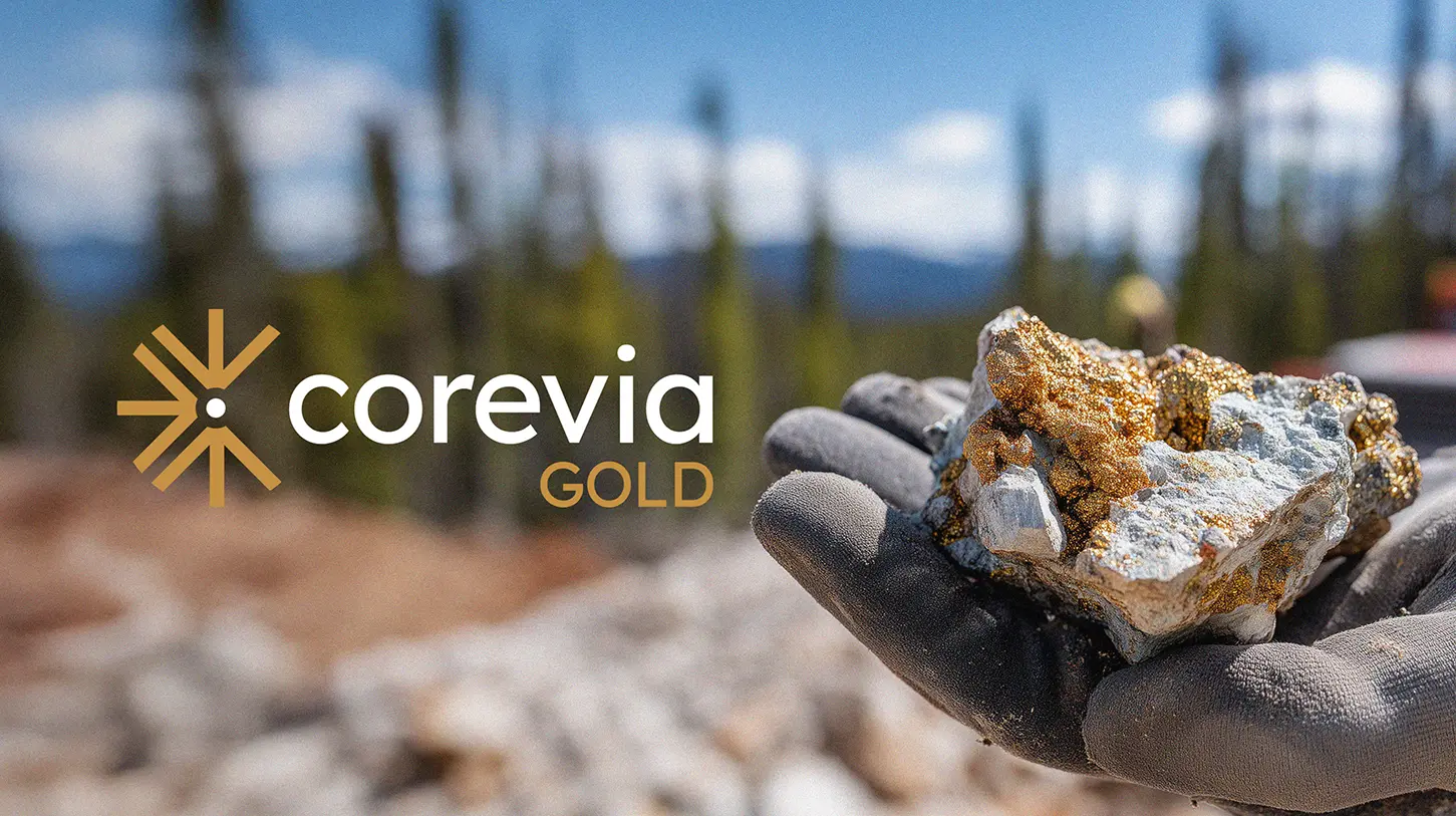
We developed a strong brand identity centred around convergence. The symbol points inward, toward the core, reinforcing the company's focus and long-term impact. The gold colour directly reflects the resource at the heart of the business. Clean, clear and quietly assertive. It invites trust without shouting for attention.
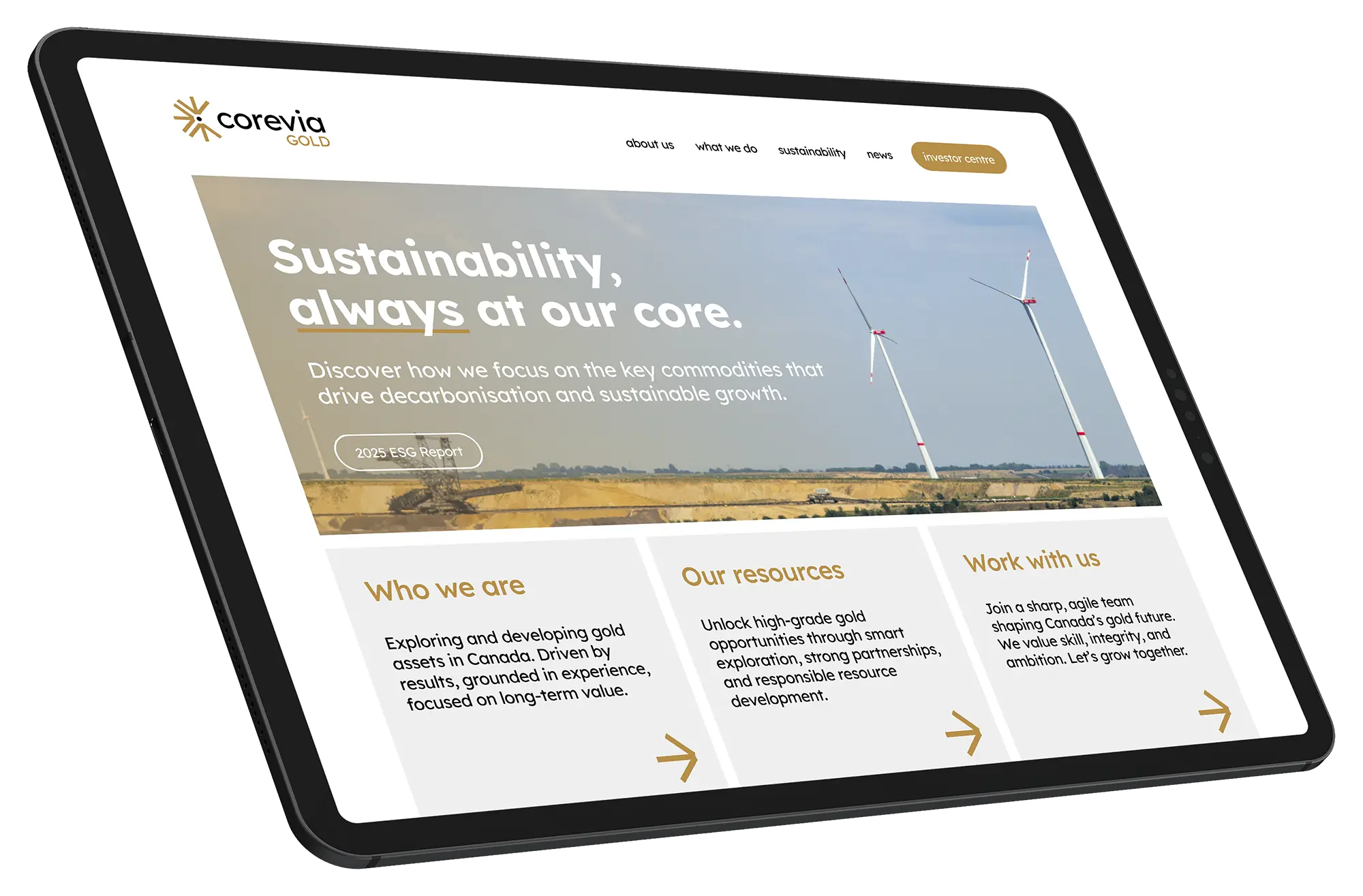
Corevia Gold's website brings the brand to life through clear messaging, bold hierarchy, and grounded visuals. From ESG reporting to talent attraction, the design communicates credibility and modernity without losing its industrial roots. Clean layouts and intuitive navigation support investor confidence while reinforcing the company's focus on sustainability, value, and growth.